


i2i
Lead UX/UI Designer
Role
UX/UI Design Lead
Team
Jamie Nicholson
Joe Fox - Web Developer
Duration
2 Weeks
About the project
This was a business proposal for i2i that would have two key stages. A visual redesign of their product website and later, the creation of a mobile app to stand alongside it. The goal was a well-executed redesign to enhance their online presence, breathing new life into their product whilst staying true to their business goals.
Problem Statement and Users
i2i is a company specialising in providing bespoke development programmes to clients. Their clients receive a website in which they can manage their programmes and staff, tracking things such as scores, completion rates and more. The problem with the website was less about functionality, though I was also tasked with streamlining user journeys, and more about visual design and brand identity.
The users varied from managers and team members, who would use the programme to develop their skills and track their progress. Managers would have the extra need to manage and oversee everyone in their team. Similar to some of my other case studies, the ability to do this whilst on the move, or away from a desk, was important. And users will shy away from applications that appear, in both look and feel, to be clumsy, meaning the final product had to be enticing and comfortable to use.
Methodology and Challenges
My design methodology for the i2i platform redesign was grounded in a user-centred and research-led approach, balancing functional efficiency with a renewed sense of visual and brand cohesion. I began by engaging with key stakeholders and analysing existing user journeys to understand the needs of both managers and team members. This helped uncover key challenges, particularly around visual inconsistency, mobile usability, and an overall lack of engagement, despite the platform’s strong functional foundation.
With these insights, I moved into an iterative design process focused on streamlining user flows and clarifying interaction patterns. Wireframing and prototyping were used to refine how users navigated core tasks, ensuring managers could easily oversee team progress while individuals could intuitively track their own development. The visual design phase translated i2i’s professional yet approachable identity into a cohesive interface, defined by a confident colour palette, clear typography, and consistent hierarchy. Regular usability testing and responsive design considerations ensured a smooth experience across devices. The result was a platform that not only improved usability and accessibility but also strengthened i2i’s brand presence through a modern, cohesive visual language.
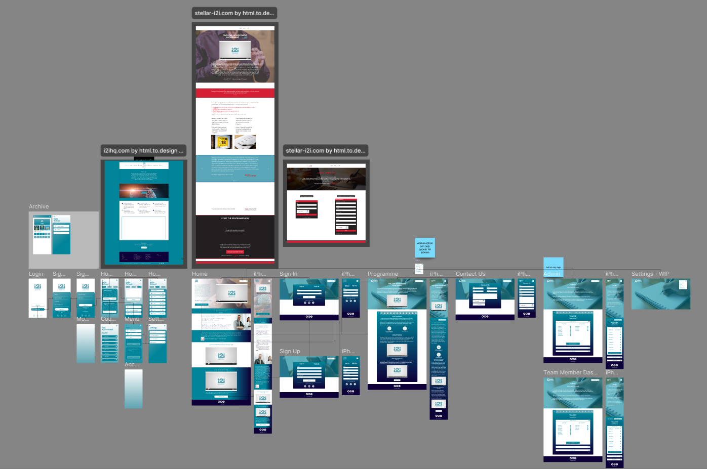
Design
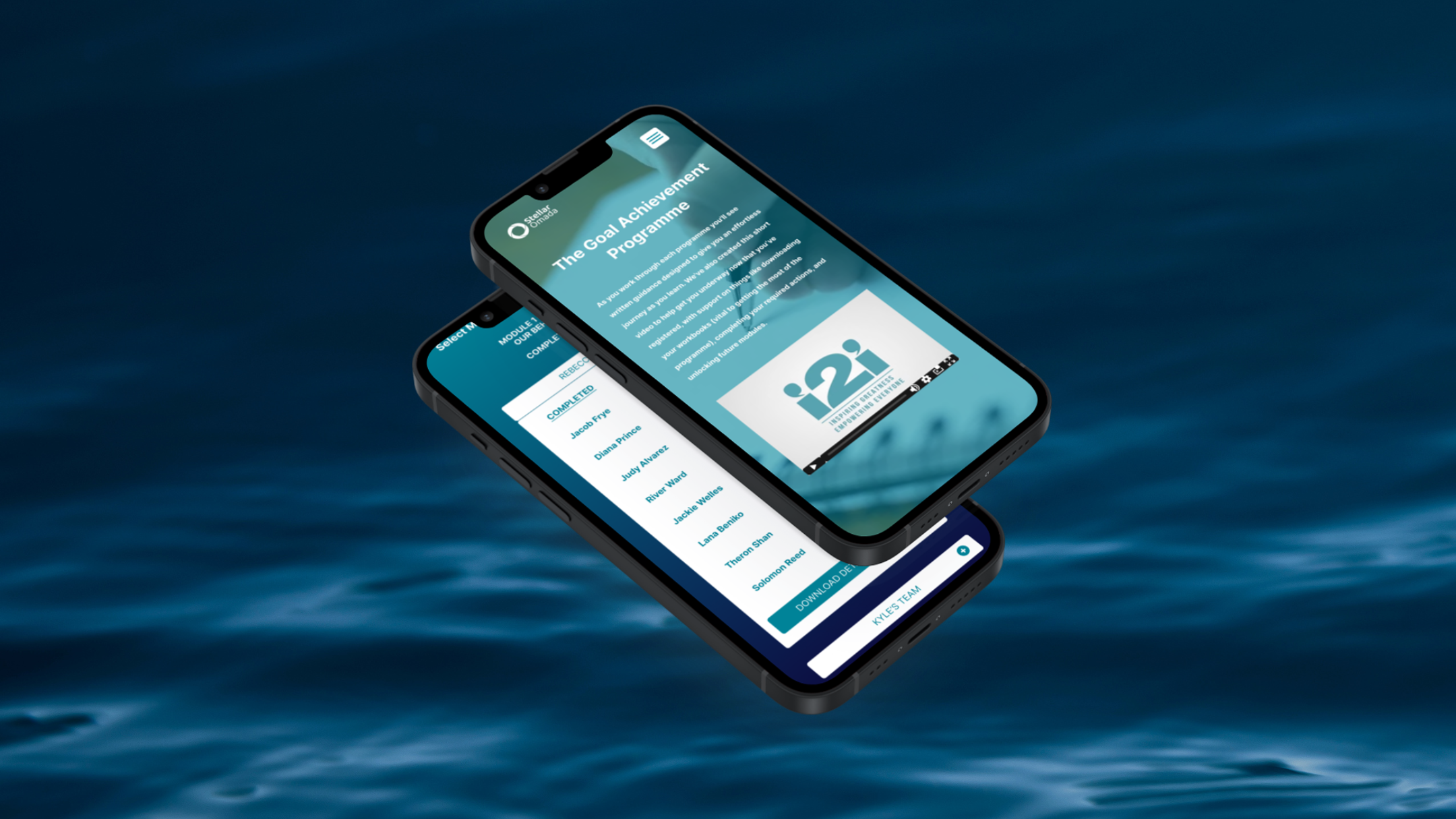
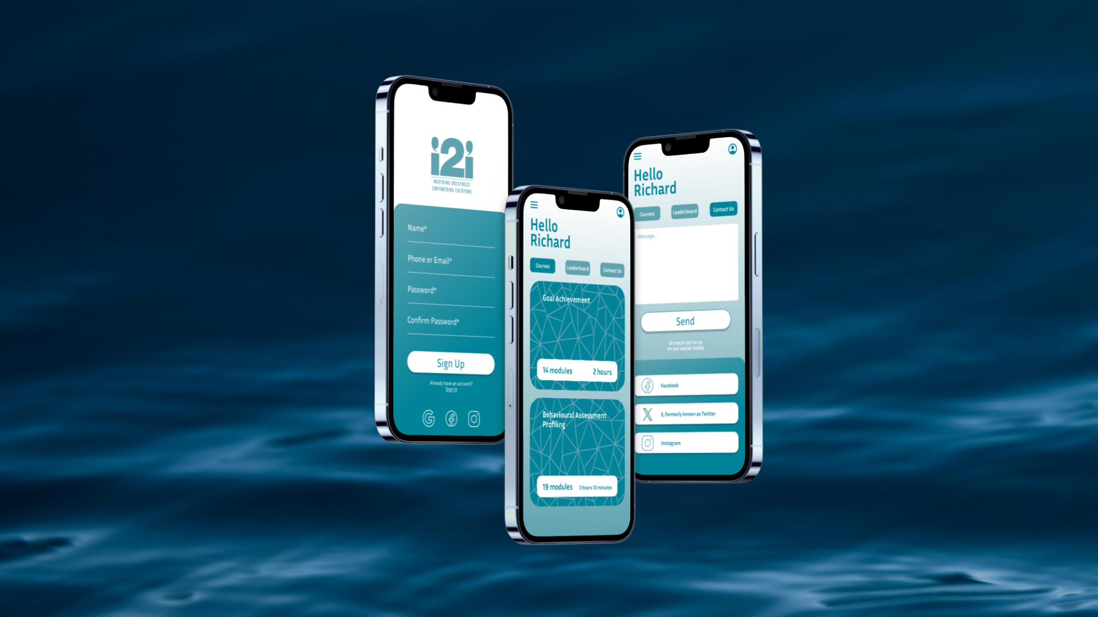
The old design was very disjointed, featuring blocky elements and mismatched colours in an attempt to be customisable. My design philosophy was to condense information into neat and expandable segments, emphasizing clear navigation and accessible display. This also included restructuring the information architecture and visual hierarchy, to focus on the key elements and services provided. With the potential for so many results, the drop-downs allowed for reduced scrolling and segmentation. For the sake of clarity, I also included symbology where needed, including visual locks on courses not yet available, that would update as the user progressed.
I also conducted a complete overhaul of the visual aesthetic. Their idea to customise the colour scheme depending on the brand of their clients was nice on paper but translated poorly into the actual product, resulting in unappealing colour clashes. I leaned into their main colour scheme, using a gradient to add a layer of contrast.
When designing the mobile app variant, I had to condense things further and remove the gradient as it would have been overwhelming compared to the website, where I used plenty of white space in both a literal and metaphorical sense to break up the colour.
Some key features I included were:
Accessible navigation
Clear signposting for content completion and progression
Overview of course details such as duration, number of modules and more
A bookmark feature to track desired subjects
Results and Reflections
Although the redesigned platform did not progress to launch due to a shift in business goals, the project delivered strong validated outcomes through stakeholder reviews and prototype testing. The new design system and user flows received positive feedback for their clarity, accessibility, and alignment with i2i’s brand values. Usability testing demonstrated marked improvements in task efficiency and user satisfaction, particularly around navigation and mobile performance. The process also provided i2i with a scalable design framework and a refreshed visual identity ready for future implementation. Beyond deliverables, the project strengthened collaboration between myself and the development teams, laying a solid foundation for any future iterations or rollouts of the platform.
This project reinforced the importance of aligning user experience improvements with a clearly defined brand vision. Working within an existing, functionally sound platform challenged me to think beyond usability alone and focus on how visual design and interaction patterns can elevate perception and engagement. Collaborating closely with stakeholders and testing early prototypes highlighted the value of communication and iteration in achieving consensus around design direction. It provided valuable insights into balancing business goals with user needs and strengthened my ability to deliver design systems that are both scalable and adaptable for future implementation.