-
The Project
Muse is a form of social media site, designed for musicians wanting to meet new people, or more specifically, find people in a certain area they can practice with, after filtering instrument, location, and sex if looking for vocalists.
-
The Goal
The goal of this project was to create something that could stand up to existing websites as a social media platform, with its own unique spin on things. It needed its own brand identity, and had to be accessible for newcomers.
-
The Problem
When working on this project, I was trying to fill a gap in the market, as websites such as this (with a specific group of people in mind, such as musicians) tend to be rare.
My Role
Once more, I fulfilled every role throughout the project, from research to the complete design process. I conducted a competitive audit and a number of usability studies at both the low and high fidelity stages of the website.
Research
From conversing with musicians I know personally, to my own experience as a drummer, I was able to understand a range of perspectives regarding the website. Feedback was almost unanimous that the website would be very helpful when it came to finding other musicians to play with, on all levels, although primarily for those with a more casual approach to music. Competitors would include the likes of Soundcloud, however, whilst serving musicians, it does so differently, being more about sharing and gaining followers, much like Instagram.
Initial Design Phase

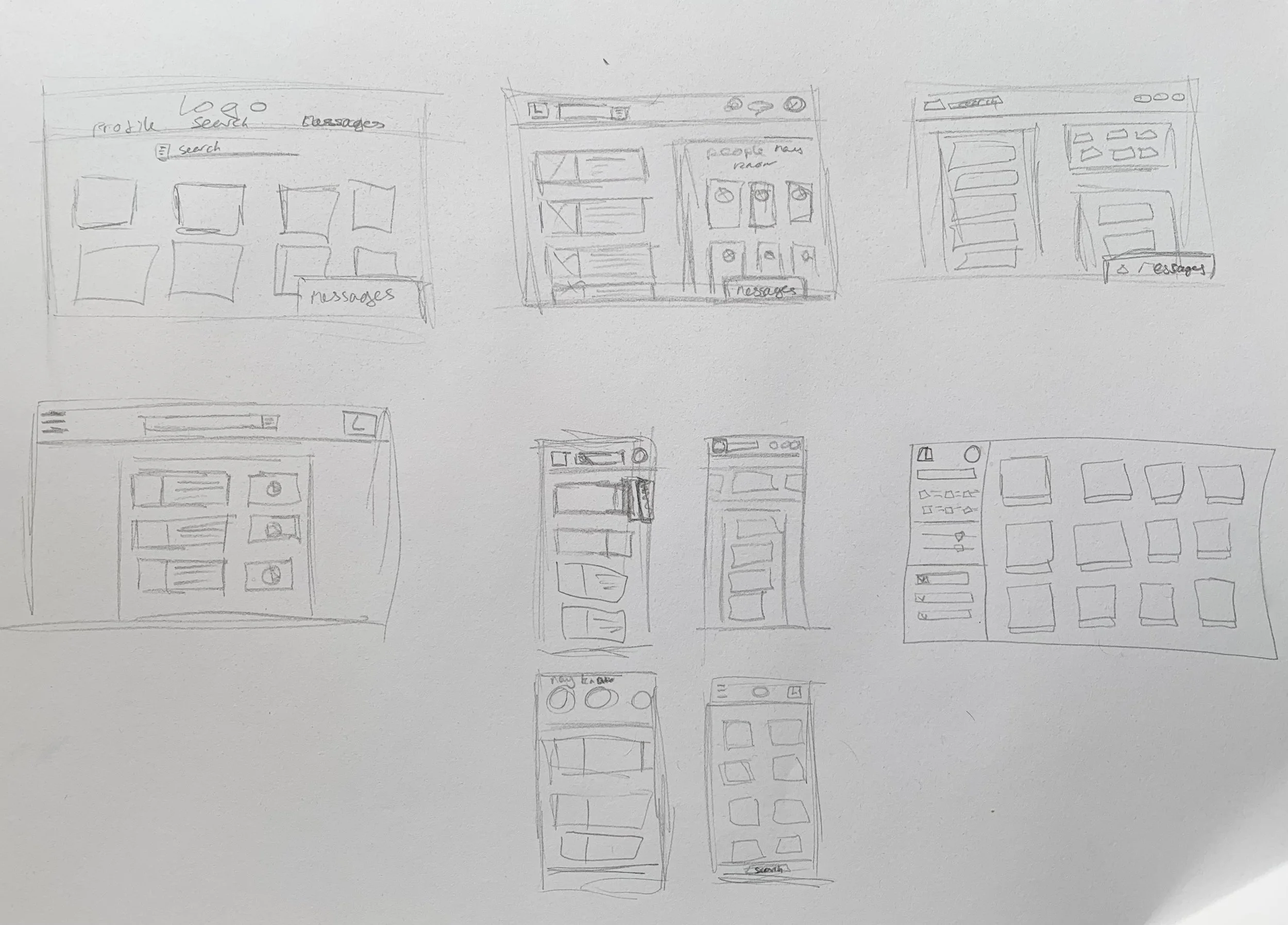
This is the LoFi prototype I created for Muse. I placed a focus on proximity and similarity in the designs, to help users navigate more effectively. Something of note, is that I struggled with overlays in Adobe XD, particularly when that overlay had to be present on each screen.
Initial Feedback
“Having a smaller message tab is useful. It means you can continue a conversation whilst doing other things.”
— Participant 4
“The filter option isn’t interactive at the moment, but it would be good to have. when finding people”
— Participant 1
“The message button is buggy. When it pops up, nothing else becomes interactive.”
— Participant 2
“Visually, I rate this. It looks like it could be an actual, professional website.”
— Participant 2
Iteration
The initial designs were not too different from the final product. As seen in the feedback above, most of the issues came from certain issues with interactivity. If I were to continue working on this product, I would certainly make further amendments to the overlay issues, as well as revamp certain sections of the profile, such as the friends’ box, where no names are displayed.
Sticker Sheet

Takeaways
I’m pleased with the final result of the website overall, however, I did find this project challenging in its own way. From working with overlays in a new software, to spreading out elements in an accessible manner, whilst also retaining a positive visual design, it made me appreciate the designs of social media sites more.


