


-
The Project
This project was focused on social good, in this instance focusing on a charity dedicated to the preservation of whales. The idea was to create a dedicated mobile app and responsive website, catering to different types of potential users. More specifically, dedicated and casual users.
-
The Goal
The goal of this project was to create something with a unique brand identity, that was different to earlier projects. The app and website had to be simple to use and focused on its primary goal, which would be to donate and manage subscriptions.
-
The Problem
The problem I was trying to solve, was the complexity of such charity sites. I intended to both expand on it with the mobile app, for users with a level of investment and reduce it for casual users on the website version. In both cases, it needed to be simple and to the point.

My Role
I was the sole contributor to this project, outside of the participants who aided the design process with their feedback. I handled every element of the design process, as well as the research and conduct of the usability studies.
Research


The target users can be grouped into two essential categories. Casual / one time users, and regular contributors. Immediately, my thought process was that those who subscribe or donate more regularly would like a more informative and interactive experience, perhaps also whilst on the move, whilst one time users may simply wish to donate and move on. There was also the issue of an older user base, which I tried to accommodate by making the website layout as simple and easy to follow as I could, whilst maintaining a visual appeal.
Initial Design Phase
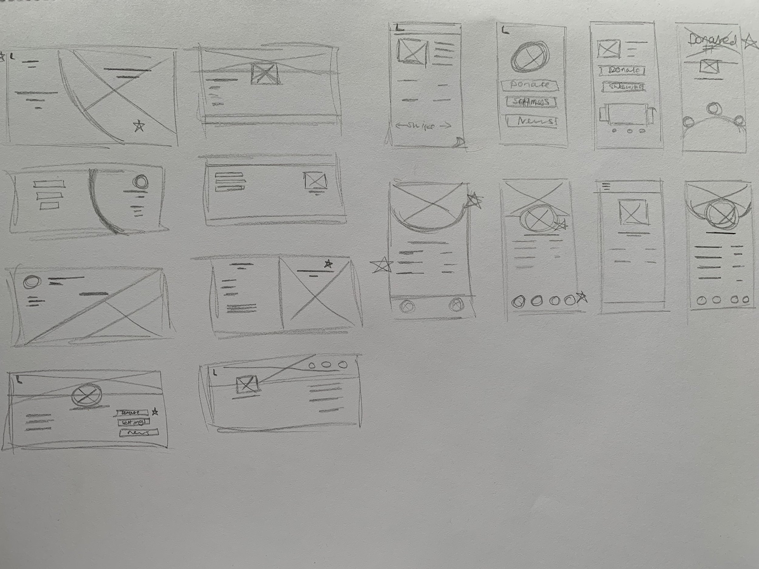

These are the LoFi prototypes I created for users to interact with. Immediately, you can see that the website version is very simple in both layout and design. The app version, as seen below, is substantially more complex since its target user base would be more invested in the charity.

Initial Feedback
Much like my previous projects, I selected five participants with various relationships and experiences with charities. The usability study was unmoderated and remote, so that the participants could go through the app and website comfortably and at their own pace.
“The ability to suddenly change path or webpage is a nice touch.”
— Participant 3
“The path is easy, and the lack of options ironically works well for what the app is meant to be.”
— Participant 1
“Maybe a recommended donation amount would be good?”
— Participant 2
“The design is rather simple, there’s a lot of free space.”
— Participant 3
Iteration
Iteration for this project was not as lengthy as my previous ones. As I was focused on the main goal and path users would take, there were not as many options presented. Profile pages for charity websites are already uncommon from what I have found, and the only other features I deemed necessary were the donations and the information provided about the charity itself. Feedback from users was positive overall, with only minor issues being raised. As such, the overall design remained highly consistent, more so for the website than the app.


Sticker Sheet

Takeaways
My takeaways from this project were that, ironically, products with fewer features can be more difficult to design. With far fewer interactions available, it was easy to have too much free space. On top of this, I realised post final product that I had forgotten to add margins to the main website. It was not mentioned in feedback and was a factor I simply glossed over, which is something I shall strive to learn from. What’s more, while I’m pleased with the designs I created, there is a lack of brand consistency found in the app and website versions. It was a personal decision, as the brighter colours did not work as well on a larger scale, however the importance of a recognisable brand is something that I need to focus on going forward.